Web Ordering’s Design System
Building Seamless, Scalable, and Brand-Driven User Experiences
COMPANY: FOODTEC SOLUTIONS
Project Foundations
Introduction to the Design System
Objective
The Web Ordering Design System is a collection of stable, reusable components built to create seamless and intuitive online ordering experiences for restaurants and food service businesses. While the core elements ensure consistency, usability, and efficiency, each customer will have a unique brand identity reflected through customizable colors and styles. This system balances flexibility and reliability, allowing restaurant chains to maintain their distinct look while benefiting from a well-structured, high-performing interface that enhances user satisfaction and boosts profitability.
Key Goals of the Project
Enhance Usability
Develop intuitive and user-friendly components that streamline the ordering process, reducing friction for both customers and restaurant staff.
Ensure Brand Flexibility
Allow each restaurant to customize their brand colors and imagery while maintaining consistency across core elements like typography and layout.
Promote Accessibility
Build a design system that complies with WCAG 2.1 Level AA standards, ensuring inclusivity for all users.
Improve Visual Consistency
Create a cohesive look and feel by using predefined typography, color palettes, and spacing standards, enabling faster development and reducing design inconsistencies.
Support Scalability
Provide reusable components and guidelines that accommodate growth, allowing the system to adapt seamlessly to new features, devices, and use cases.
Simplify Development
Ensure seamless collaboration between design and development teams by providing detailed documentation, interactive prototypes, and predefined component specifications.
Foundations
Brand Guidelines
Logo Usage
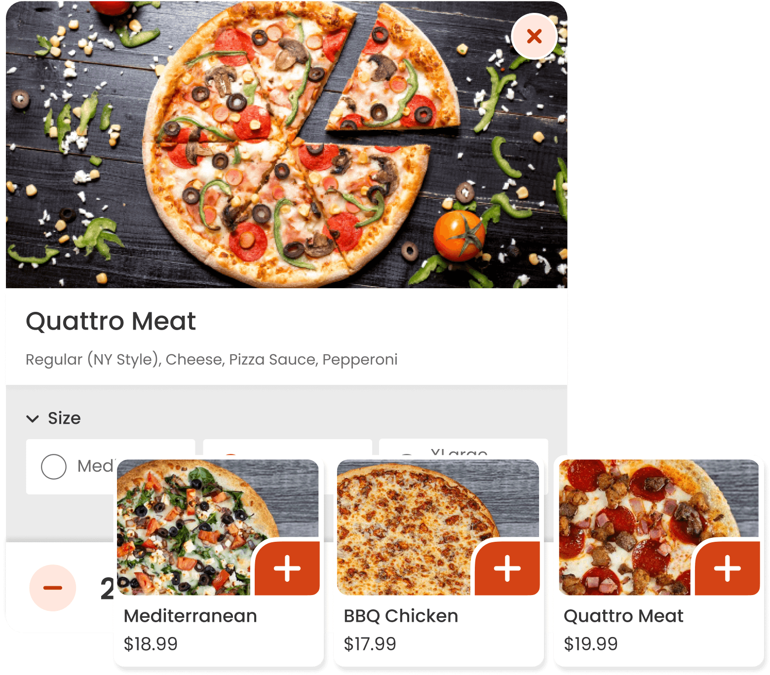
Customers must upload a high-quality PNG logo that is clearly visible on a white background to ensure clarity across all interfaces. Logos should be crisp, well-defined, and free from pixelation. To maintain brand integrity, avoid stretching, distorting, or altering the logo’s proportions.
Brand Colors
The platform automatically generates a brand color palette based on the primary color detected in the uploaded logo. However, customers can customize and fine-tune these colors through the editor to match their branding needs while ensuring sufficient contrast for accessibility.
Typography
The system uses a predefined typography to maintain consistency and readability across all interfaces. This ensures a polished and professional user experience without requiring additional configuration.
Imagery
Customers are responsible for uploading high-quality, professional images for menu items, specials, and promotions. Images should be well-lit, visually appealing, and properly framed to enhance the user experience and increase engagement. Avoid blurry, low-resolution, or cluttered backgrounds that could reduce the platform’s visual appeal.
Core Design Principles
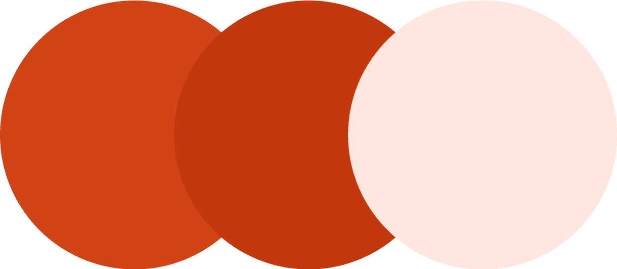
Brand Colors (Customizable)
Each customer can define their Primary and Secondary Colors, which are automatically generated based on the uploaded logo but can be adjusted through the editor.
Primary
Used for primary buttons, icons, text buttons, components that need attention, and active states.
Dark Primary
Used for text inside the primary container when a darker shade is required to meet accessibility standards.
Primary Container-Secondary
A lighter shade of the primary color, is used for secondary actions and components that require less emphasis, ensuring a balanced visual hierarchy.

Neutral
Are consistent across all customers and are used for essential elements such as text, borders, and other supporting components.
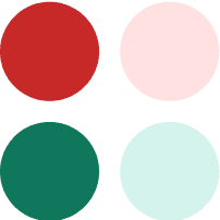
Semantic
Error colors are used to highlight issues or invalid inputs, while success colors indicate positive outcomes or completed actions.
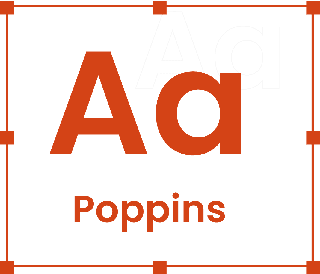
Typography
The Web Ordering Design System uses the Poppins font for its clean and modern appearance. The typography is structured to create a clear visual hierarchy and maintain readability across the platform.
Prominent Headings
Font size: 28px
Heading 1
Heading 1
Heading 1
Heading 1
Heading 1
Headings
Font size: 24px
Heading 2
Heading 2
Heading 2
Heading 2
Heading 2
Small Headings or Emphasis
Font size: 20px
Heading 3
Heading 3
Heading 3
Heading 3
Heading 3
Subheadings or Large Body Text
Font size: 16px
Heading 4
Heading 4
Heading 4
Heading 4
Heading 4
Body Text or Labels
Font size: 14px
Heading 5
Heading 5
Heading 5
Heading 5
Heading 5
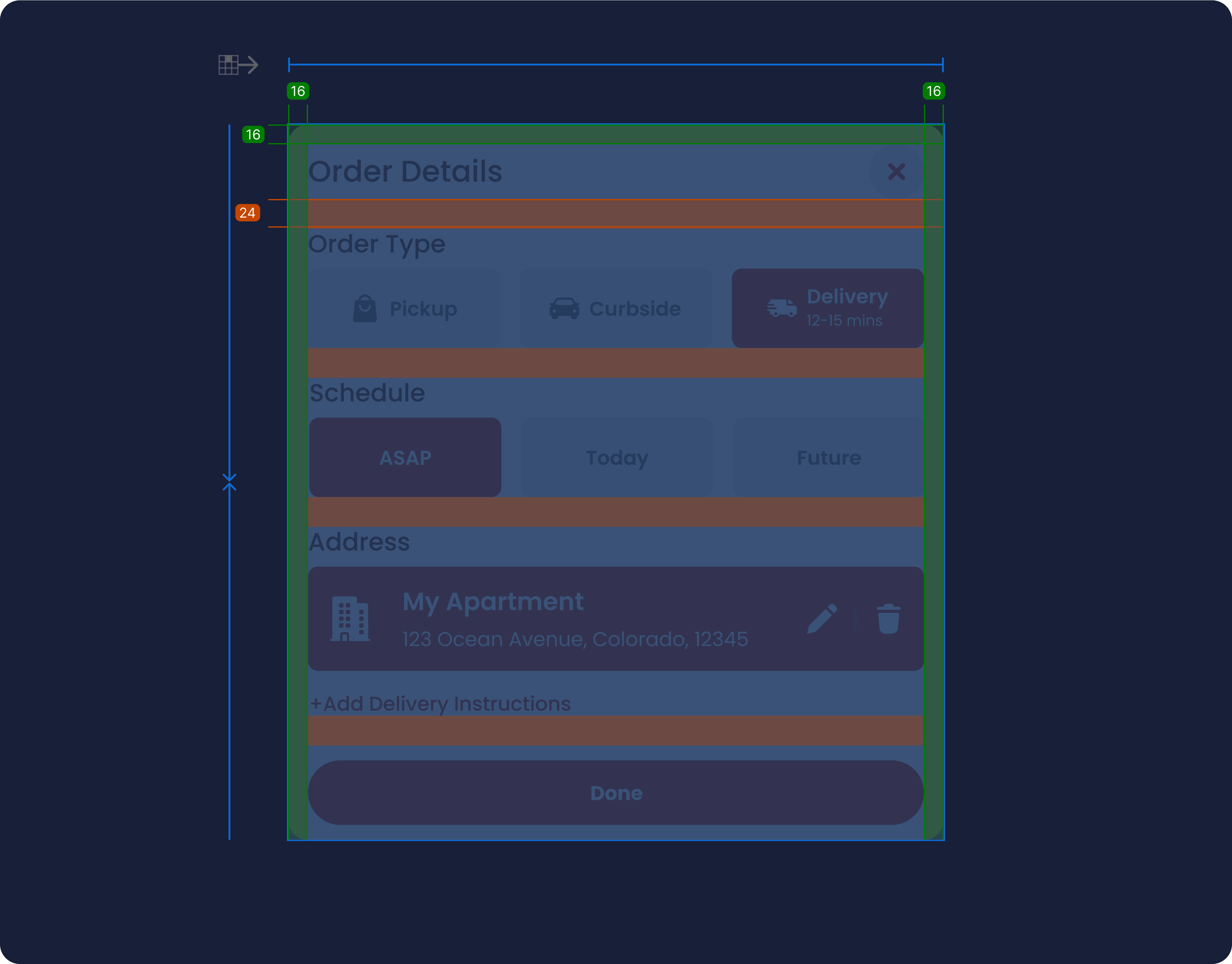
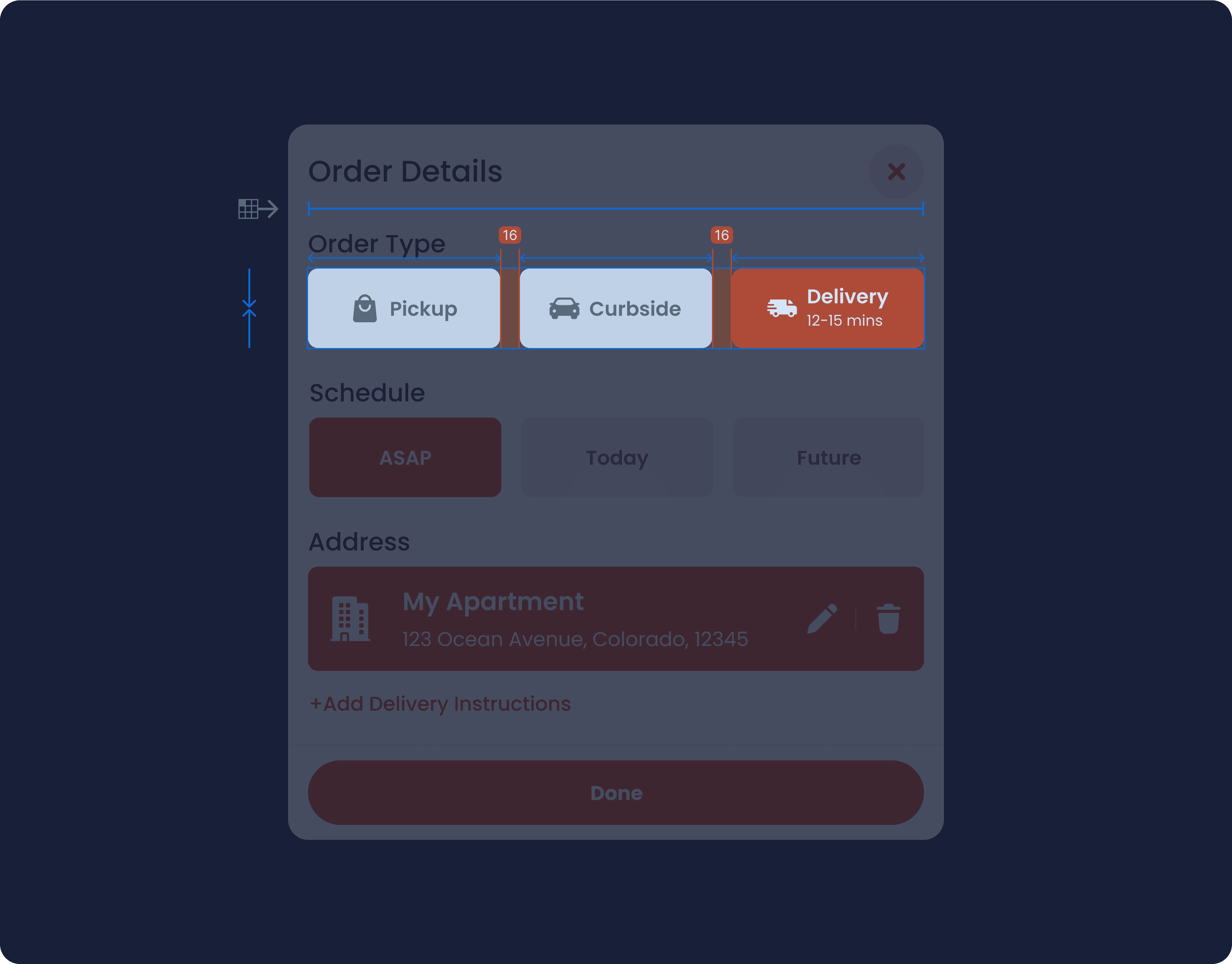
Spacing and Layout
The Web Ordering Design System follows the 8pt grid system and utilizes auto layout to ensure consistent alignment, spacing, and scalability across all components. This approach simplifies the design process while maintaining a visually cohesive user interface.
Elevation & Shadows
Guidelines for Shadow Usage
1
Menu Cards on Hover
Apply subtle shadows to menu cards when hovered over, creating a lifted effect that highlights the card and encourages interaction.
2
Pressed Buttons
Use shadows to simulate a pressed state for buttons, giving users tactile feedback and clearly indicating the action has been initiated.
3
Fixed Button Containers
Shadows are applied to fixed button containers to visually separate them from the page content and maintain focus on their importance.
4
Dynamic Visual Feedback
Ensure shadows change dynamically to reflect user interactions, such as transitioning from hover to pressed states, creating a responsive and engaging experience.
Accessibility Guidelines
The Web Ordering Design System prioritizes accessibility to ensure a seamless and inclusive experience for all users, regardless of their abilities or devices. By adhering to established accessibility standards, the system promotes usability, readability, and engagement.
1
General Principles
WCAG Compliance
The system is designed to meet WCAG 2.1 Level AA guidelines for web accessibility.
Keyboard Navigation
All interactive elements (e.g., buttons, forms, links) must be fully operable using a keyboard.
Screen Reader Compatibility
Elements include proper ARIA roles, labels, and semantic HTML to support screen readers.
2
Color and Contrast
Contrast Ratios
Text and icons must maintain a contrast ratio of at least 4.5:1 against their background.
Large text (18px or larger, or 14px bold) must have a contrast ratio of at least 3:1.
Color Usage
Avoid relying on color alone to convey information. Include text labels or icons for clarity (e.g., error states).
Ensure brand colors used by customers align with these contrast guidelines when customized.
3
Typography
Font Size
Minimum text size is 14px for readability across all devices.
Use larger font sizes for headings and important content to improve visual hierarchy.
Line Height
Maintain a line height of at least 1.5 for body text to ensure readability.
Readable Fonts
The predefined Poppins font is used for its clarity and modern design.
4
Forms and Inputs
Labels and Instructions
All form fields must include descriptive labels and placeholder text for guidance.
Use inline error messages to provide clear, immediate feedback.
Accessible Inputs
Ensure inputs are accessible to assistive technologies with proper ARIA attributes (e.g., aria-required, aria-invalid).
Error States
Use both color and text to indicate errors. Example: Red borders paired with error messages.
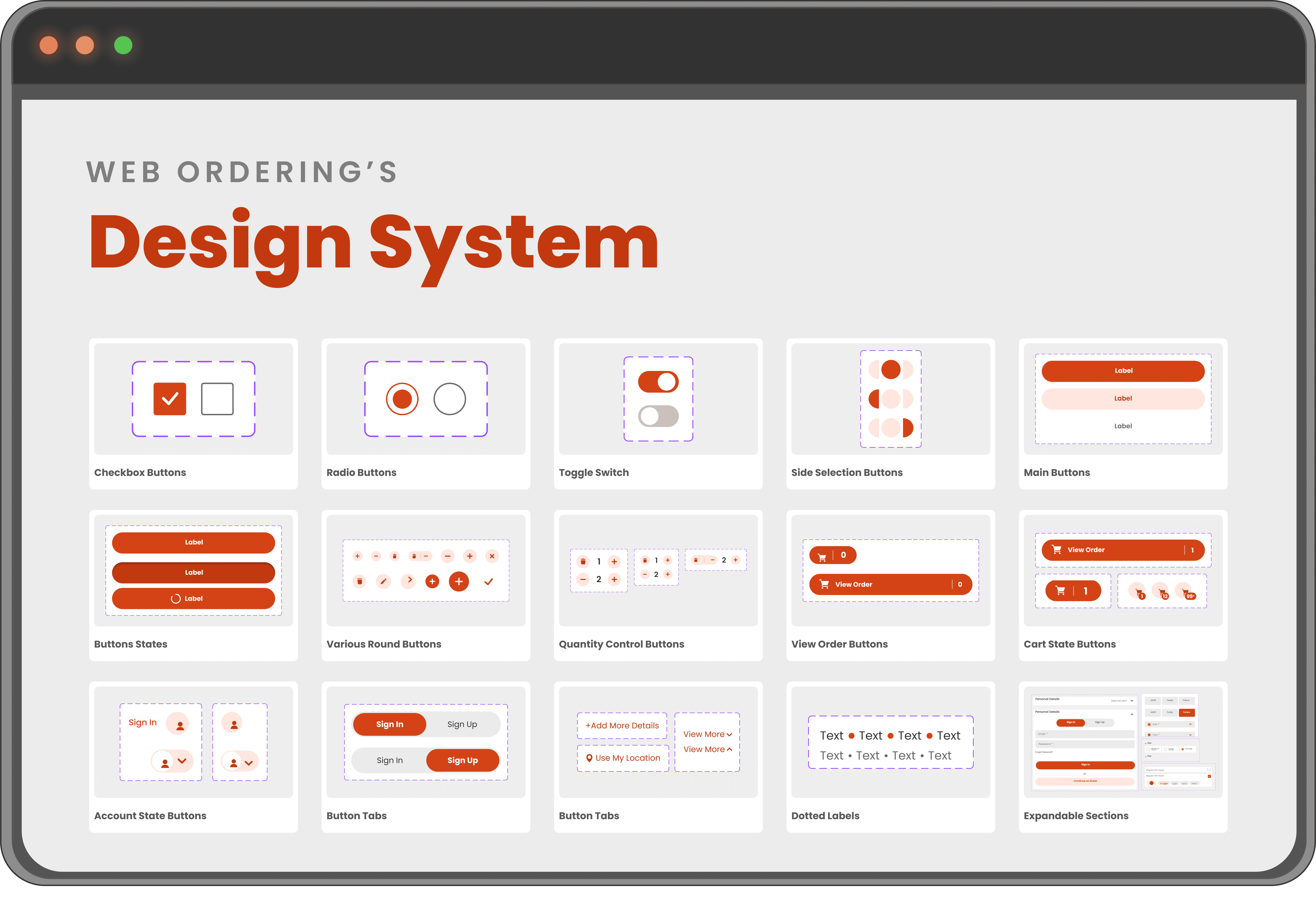
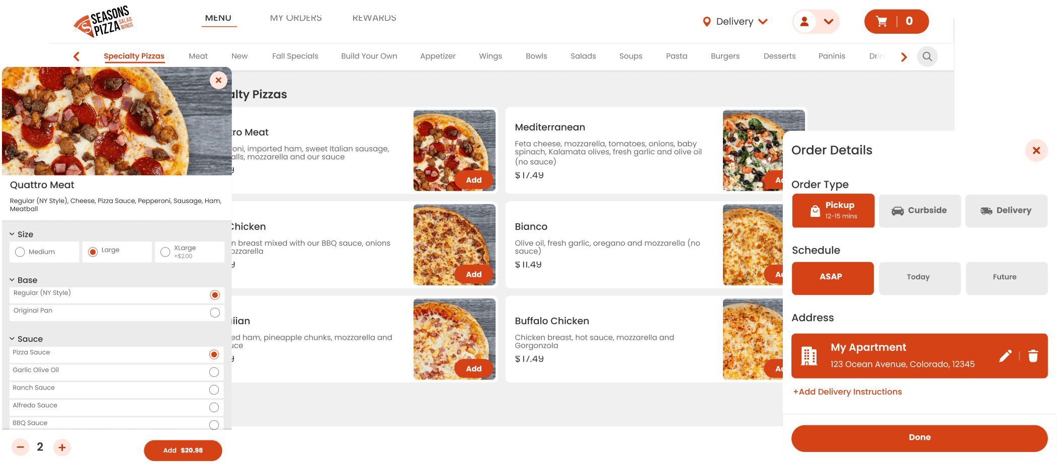
COMPONENTS
Atomic Design Building Blocks
Handoff to Developers
Bridging Design and Code
The Handoff to Developers section ensures a smooth transition from design to development, providing clear documentation, specifications, and assets for every component.
Example
Maintaining the Design System
Ensuring Consistency and Continuous Improvement
The Maintaining the Design System section outlines the processes and tools used to ensure the design system remains consistent, scalable, and up-to-date. Regular audits, team feedback, and updates allow the system to evolve alongside user needs and technological advancements, supporting a seamless experience across all touchpoints.
Key Practices for Maintenance
Regular Audits
Conduct periodic reviews to identify inconsistencies, outdated components, or areas requiring optimization.
Team Collaboration
Foster ongoing communication between designers and developers to align on updates, address challenges, and share insights.
Documentation Updates
Keep documentation clear and current, reflecting changes in guidelines, component specs, or usage examples.
Feedback Loop
Gather feedback from stakeholders, end-users, and team members to identify gaps or areas for enhancement.
Version Control
Use tools like GitHub or Figma’s versioning features to track changes and ensure a single source of truth.
Scalability Planning
Anticipate future needs and design components with flexibility to accommodate new features or branding changes.
Other Projects

Mobile version is currently under construction; please visit our desktop site for full access.
Mobile version is currently under construction; please visit our desktop site for full access.
Mobile version is currently under construction; please visit our desktop site for full access.
Mobile version is currently under construction; please visit our desktop site for full access.