Redesigning Web Ordering
A Seamless Path to Cloud Adoption and Higher Profits
COMPANY: FOODTEC SOLUTIONS


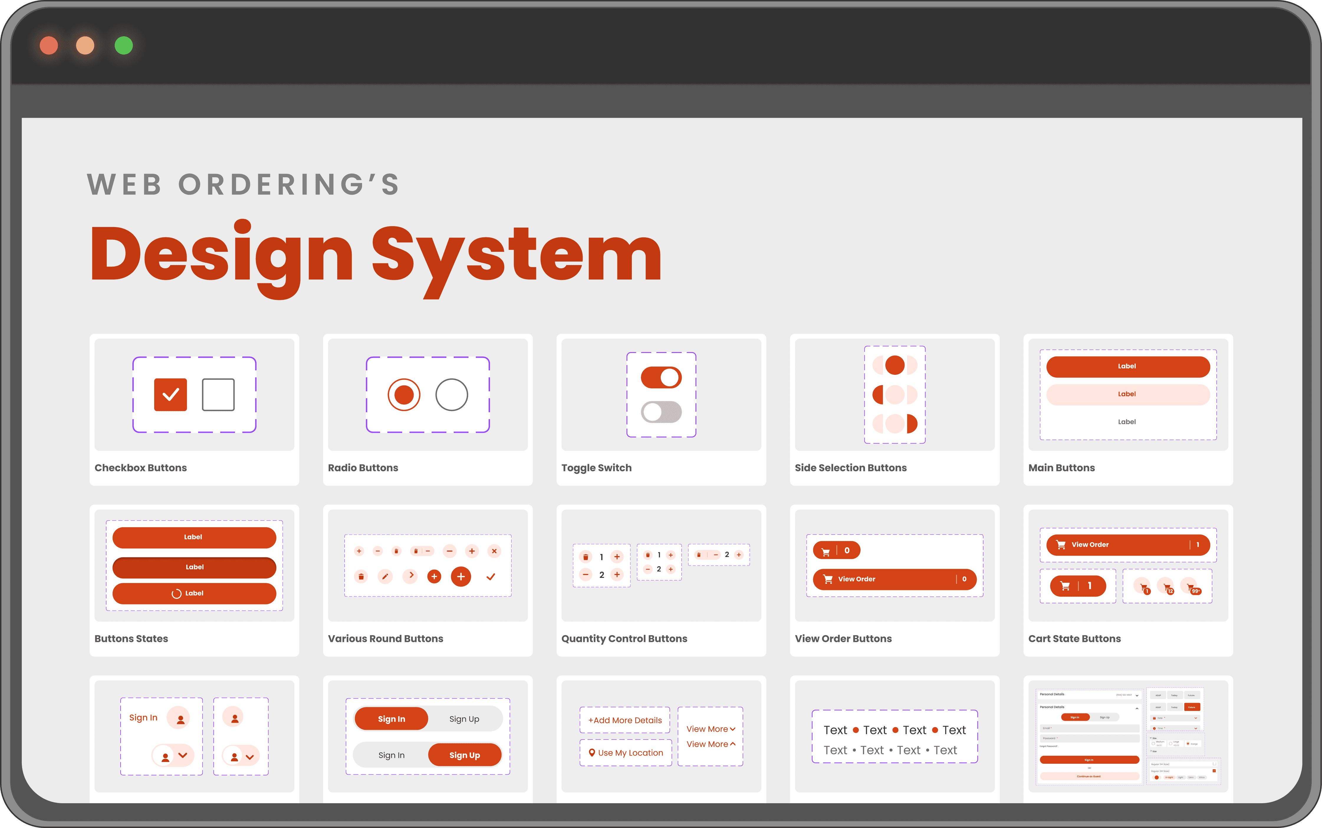
Project Foundations
Key Objectives and Goals of the Platform
Objective
FoodTec Solutions sought to revolutionize how their restaurant clients transitioned to the cloud by introducing a subscription-based model for in-cloud services. The first step in this ambitious initiative was redesigning the web ordering platform, intended to serve as a flagship offering that would entice customers to adopt cloud services.
Clients
Multiple restaurant chains and food service businesses.
Key Goals of the Project
Increasing Average Order Value
Boost revenue by integrating dynamic upselling tools and personalized recommendations.
Reducing Friction in Ordering
Simplify the ordering process to reduce frustration and completion times.
Enhancing User Satisfaction
Deliver an intuitive, user-friendly experience for customers and restaurant staff.
Delivering Higher Profitability
Enable restaurant clients to increase profitability with smarter design and functionality.
Easy Setup
Create a platform that’s easy to implement, requiring minimal support.
Superior Design Aesthetics
Design a modern, visually appealing platform aligned with current UI trends.
Existing Design


DISCOVERY
Understanding the Problem
Research Methods
Our analysis leveraged tools like Google Analytics to uncover user behavior patterns, complemented by interviews, surveys, and usability testing. This data-driven approach revealed key areas for improvement.
Key Findings


Key Findings
Low Average Order Value
METRIC
The average order value was $27, significantly below the industry benchmark of $33.
Behavioral Insight
Users rarely added complementary items due to the absence of upselling prompts during the order process.
Conversion Data
Orders with upselling opportunities had a 15% higher average value, but only 20% of users encountered these opportunities.
High Completion Times at Checkout
METRIC
Average time to complete checkout was 3 minutes 45 seconds, exceeding the industry benchmark by 45%.
Behavioral Insight
Users spent the longest time on the payment screen, with a 42% drop-off rate recorded at this step.
Device-Specific Insight
Mobile users spent an average of 4 minutes 15 seconds in checkout, compared to 3 minutes 10 seconds for desktop users, highlighting a need for mobile-specific optimization.
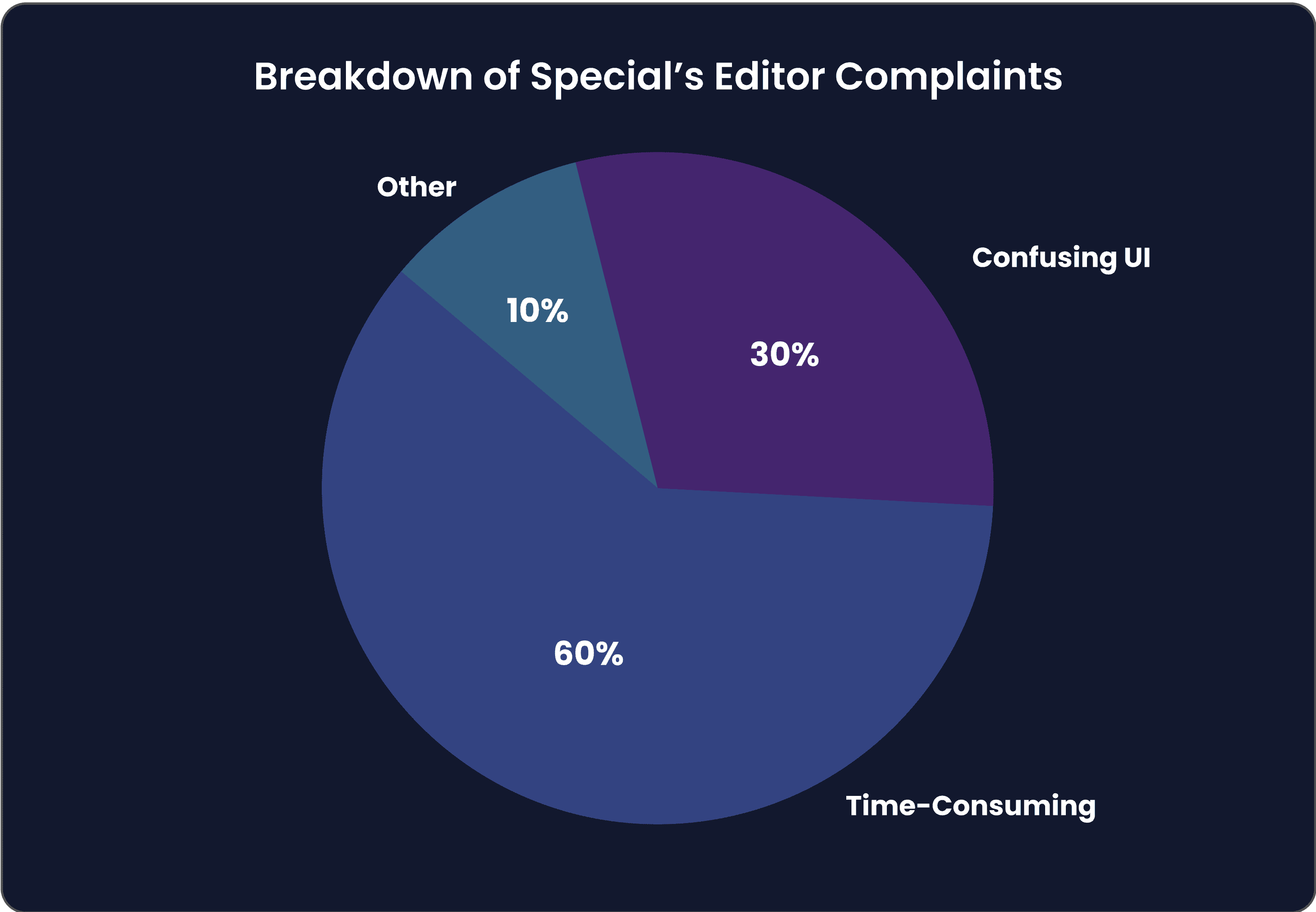
Special's Editor Challenges
METRIC
The Specials Editor completion rate was 38%, with an average task time of 5 minutes, double the expected duration.
Behavioral Insight
User feedback from surveys cited the editor as "confusing" and "time-consuming," with 60% of respondents indicating frustration.
Engagement Data
Only 18% of users regularly accessed the Specials Editor
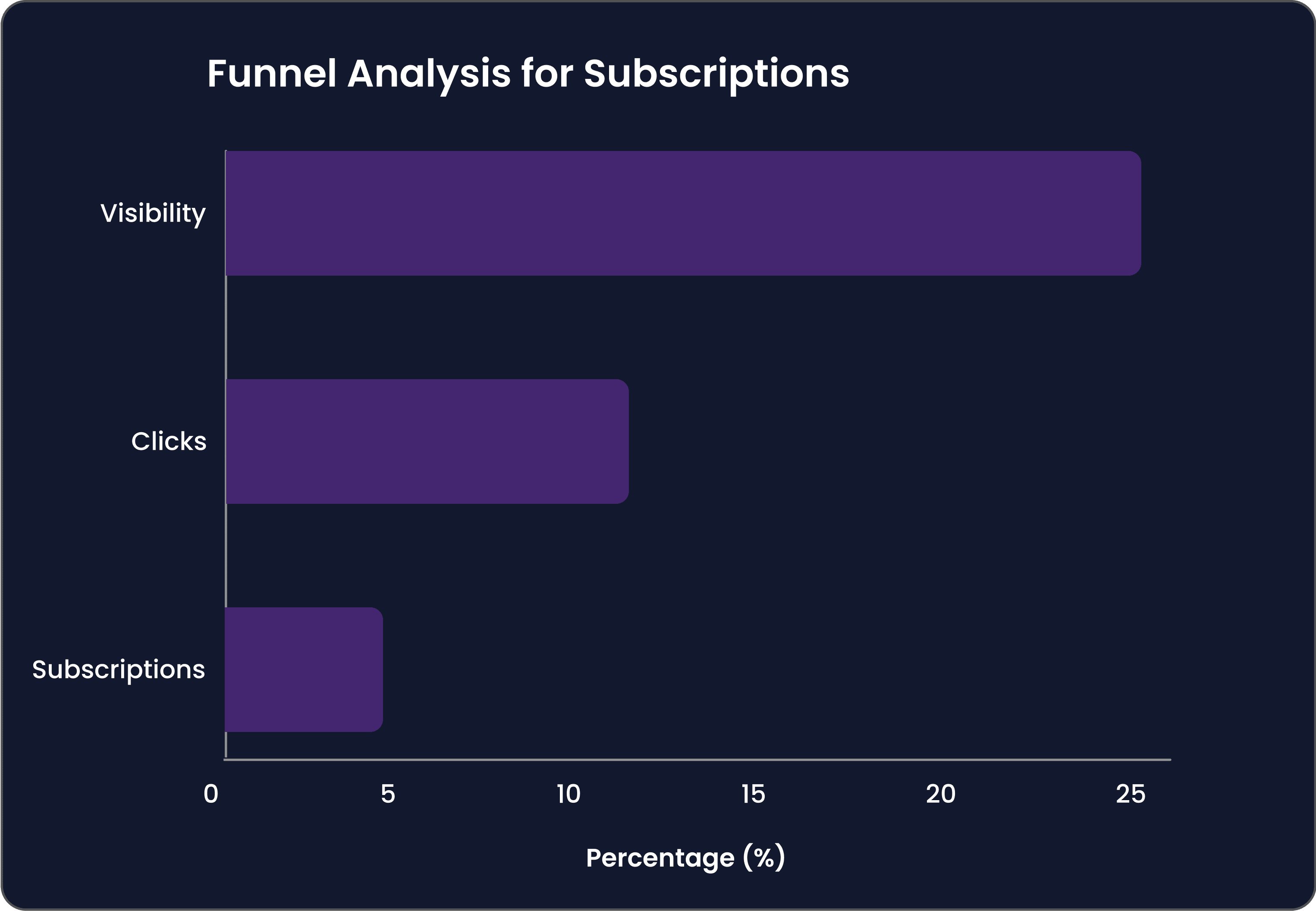
Low Subscriptions to Loyalty and Newsletters
METRIC
Subscription conversion rate was 2.1%, well below the 5% industry standard.
Behavioral Insight
Loyalty and newsletter sign-up prompts had a visibility rate of 25%, indicating poor placement on the platform.
User Feedback
Many users expressed they "didn't notice" the option to subscribe, suggesting a need for more prominent CTAs.
IDEATION
Crafting Solutions
Design Goals
Before diving into the design process, we outlined specific goals based on insights from the discovery phase:
1
Increase Average Order Value
Leverage upselling and cross-selling features to encourage users to add more items to their carts.
METRIC
Target an increase from $27 to $33 in average order value.
2
Reduce Checkout Time
Simplify navigation and the ordering flow to reduce friction for users.
METRIC
Decrease checkout time from 3 minutes 45 seconds to under 2 minutes 30 seconds.
3
Improve Special's Editor Usability
Streamline the interface for faster task completion.
METRIC
Cut task time from 5 minutes to 3 minutes and reduce complaints by 40%.
4
Boost Subscriptions for Loyalty and Newsletters
Make calls-to-action more prominent and visually engaging.
METRIC
Increase subscription rates from 2.1% to 5%.
Story of Collaboration
The ideation phase began with collaborative brainstorming sessions involving the design team, product managers, and stakeholders. Initial ideas were sketched out and refined into several design options, each aiming to tackle the key pain points identified during discovery. To ensure alignment with business goals, I conducted demos with leadership, presenting the different design directions and collecting feedback to refine the solutions further.
Layout Options
Menu
OPTION A

OPTION B

OPTION C
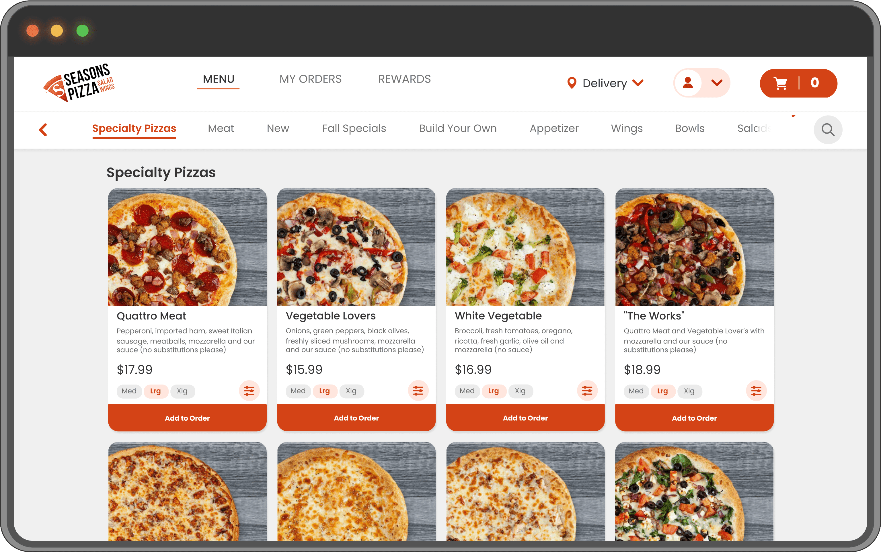
OPTION D

Special’s Wizard
OPTION A

OPTION B

OPTION C

Prototyping and Iteration
Shaping the Solution
From Wireframe to Prototype
The design process evolved through several iterations, starting with low-fidelity wireframes and gradually progressing to interactive prototypes. Each stage incorporated user feedback and real-world testing, ensuring the design addressed key pain points effectively.
Key Iterations
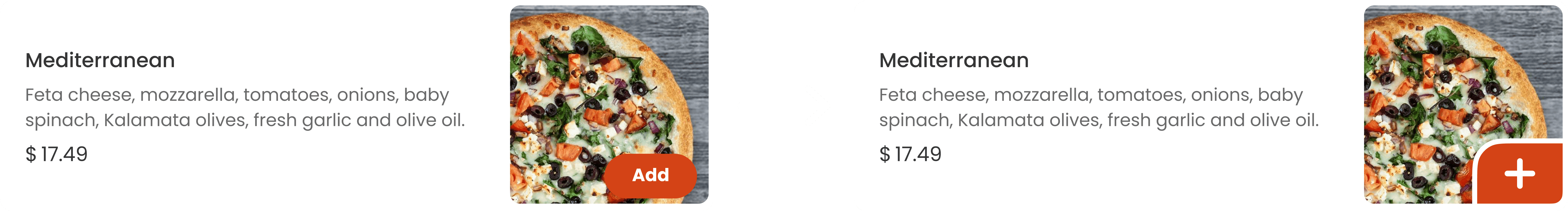
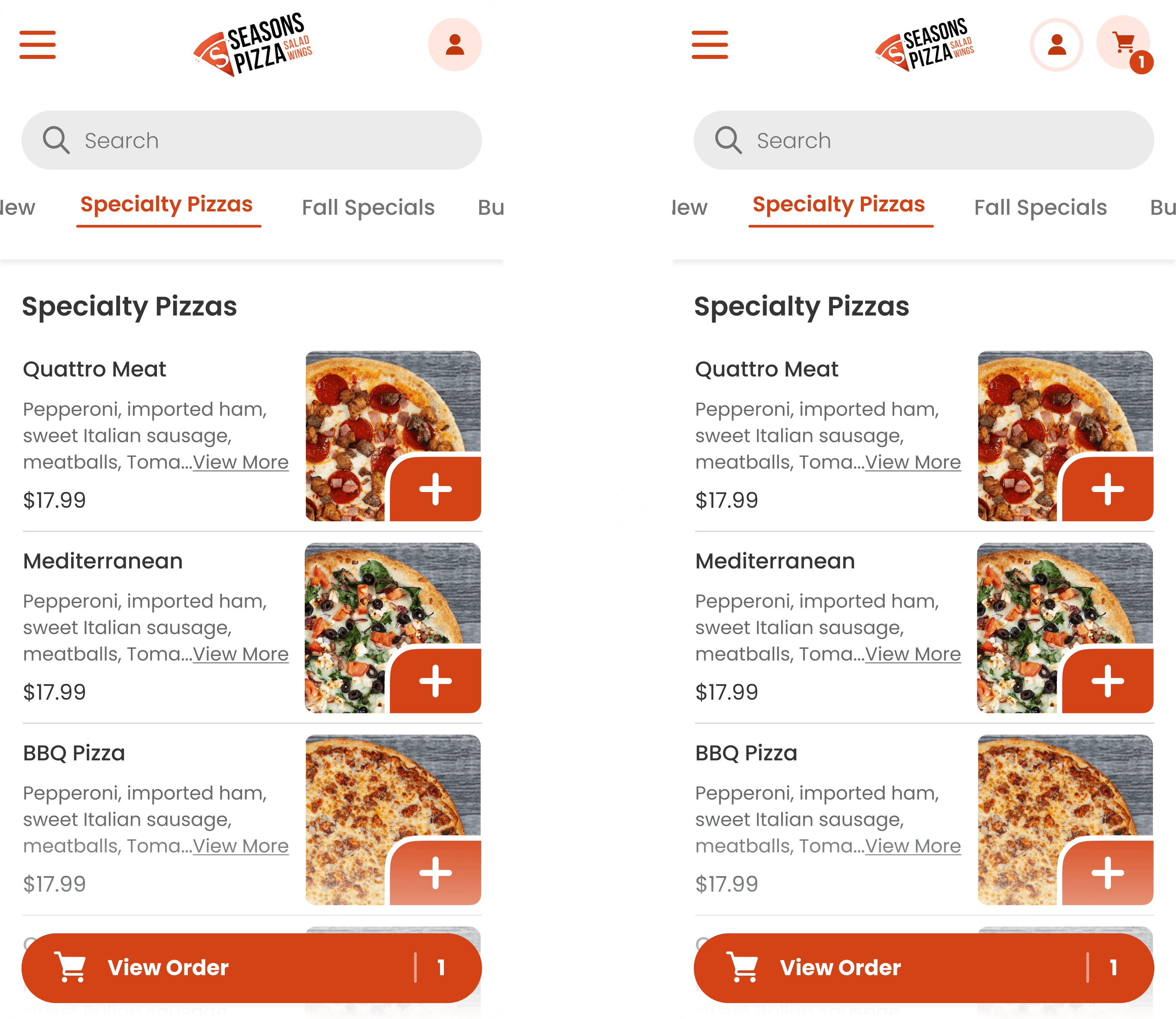
Add Button Visibility
During usability testing, we observed that the "Add to Cart" button often blended into the background, especially when paired with images under varying lighting conditions. To address this:
We added a stroke and shadow effect to the button, improving its visibility across all image types.
This change was validated through subsequent testing, where 90% of users noted the button was now easier to spot.
Persistent Cart Access
Insights from user testing revealed that users frequently searched for their order details inside the cart, particularly on mobile devices. However, the absence of a visible cart icon across screens led to confusion and increased navigation time.
To address this:
A cart icon was added to the mobile header, ensuring it remained visible on all screens.
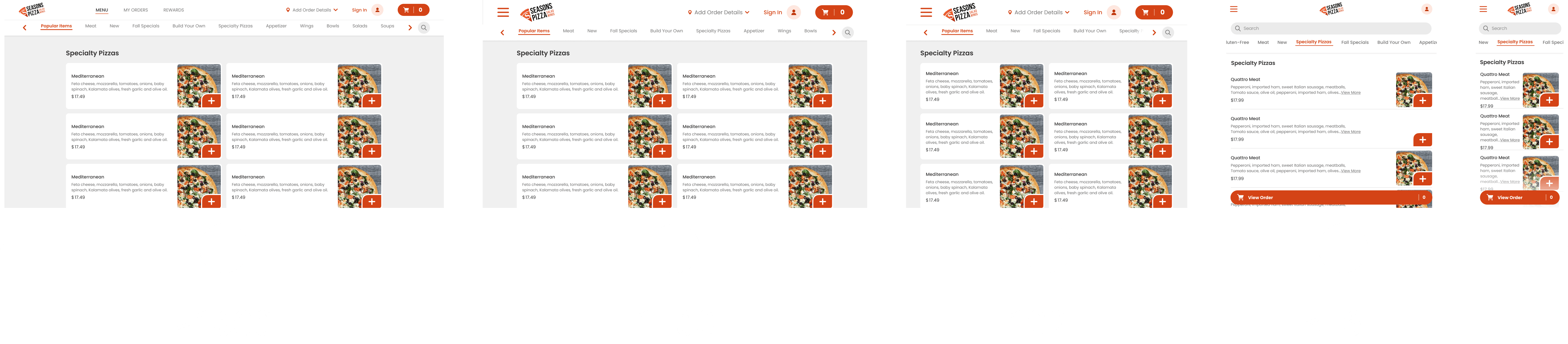
A/B Testing Insights
One of the most impactful experiments focused on order detail access:
Test A: Order details accessible only through the header menu.
Test B: Persistent cart icon providing direct access to order details.
Result: Test B outperformed Test A with:
25% faster task completion times for viewing order details.
A 15% decrease in navigation errors, as users no longer searched multiple locations.


The Final Solution
Redefining the Ordering Experience
Final Design
The final design transformed the web ordering platform into a seamless, intuitive, and high-performing solution. By addressing the four key challenges identified during discovery, we delivered measurable improvements that enhanced user satisfaction, increased revenue, and streamlined workflows. Here’s how each problem was tackled through thoughtful design and innovation.
1. Low Average Order Value
To encourage larger orders and increase revenue, we implemented dynamic upselling and cross-selling features directly within the user journey:


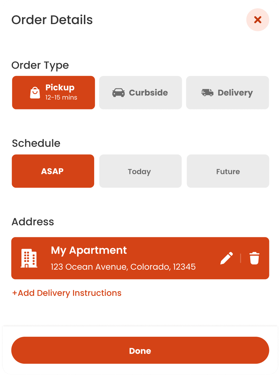
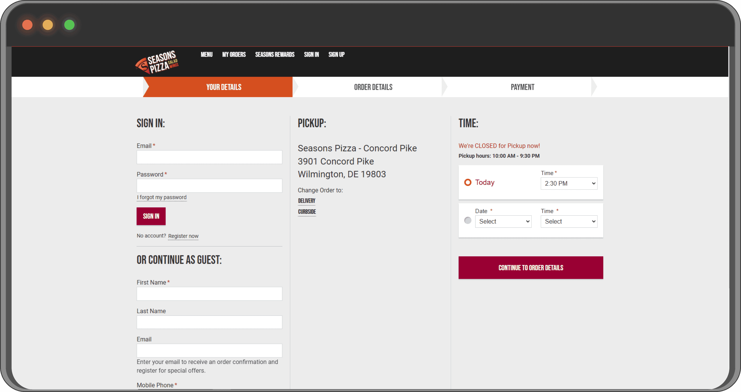
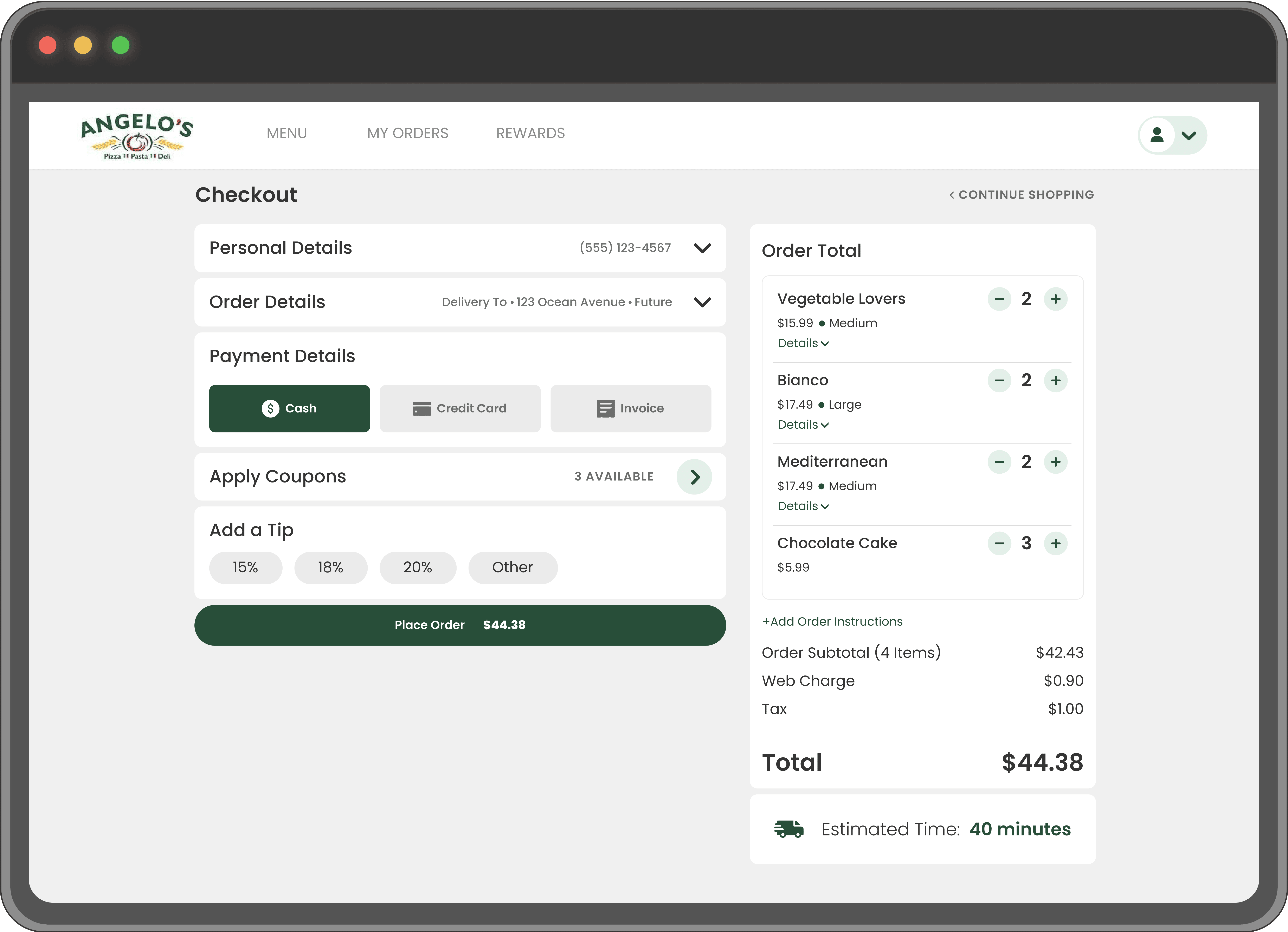
2. High Checkout Completion Time
We redesigned the checkout flow to minimize friction and make the process more intuitive:

1
Step-by-Step Process on a Single Page
Each section (e.g., "Sign In," "Order Details") collapses after completion, triggered by a single action. This ensures a clear and linear progression through the checkout process while reducing cognitive overload.
2
Access All Sections Without Disabling Tiles
Unlike traditional sequential designs, all tiles remain accessible at any time. This flexibility meets business needs by allowing users to edit or revisit specific sections without disrupting their progress.
3
Preview of Completed Sections
Filled tiles display a concise summary (e.g., delivery address or payment method), ensuring users can review their inputs at a glance without having to expand every section.
4
Sticky Order Total on the Right
The Order Total section remains visible throughout the process, providing real-time updates on items, costs, and estimated delivery time. This transparency builds trust and reduces the likelihood of cart abandonment.
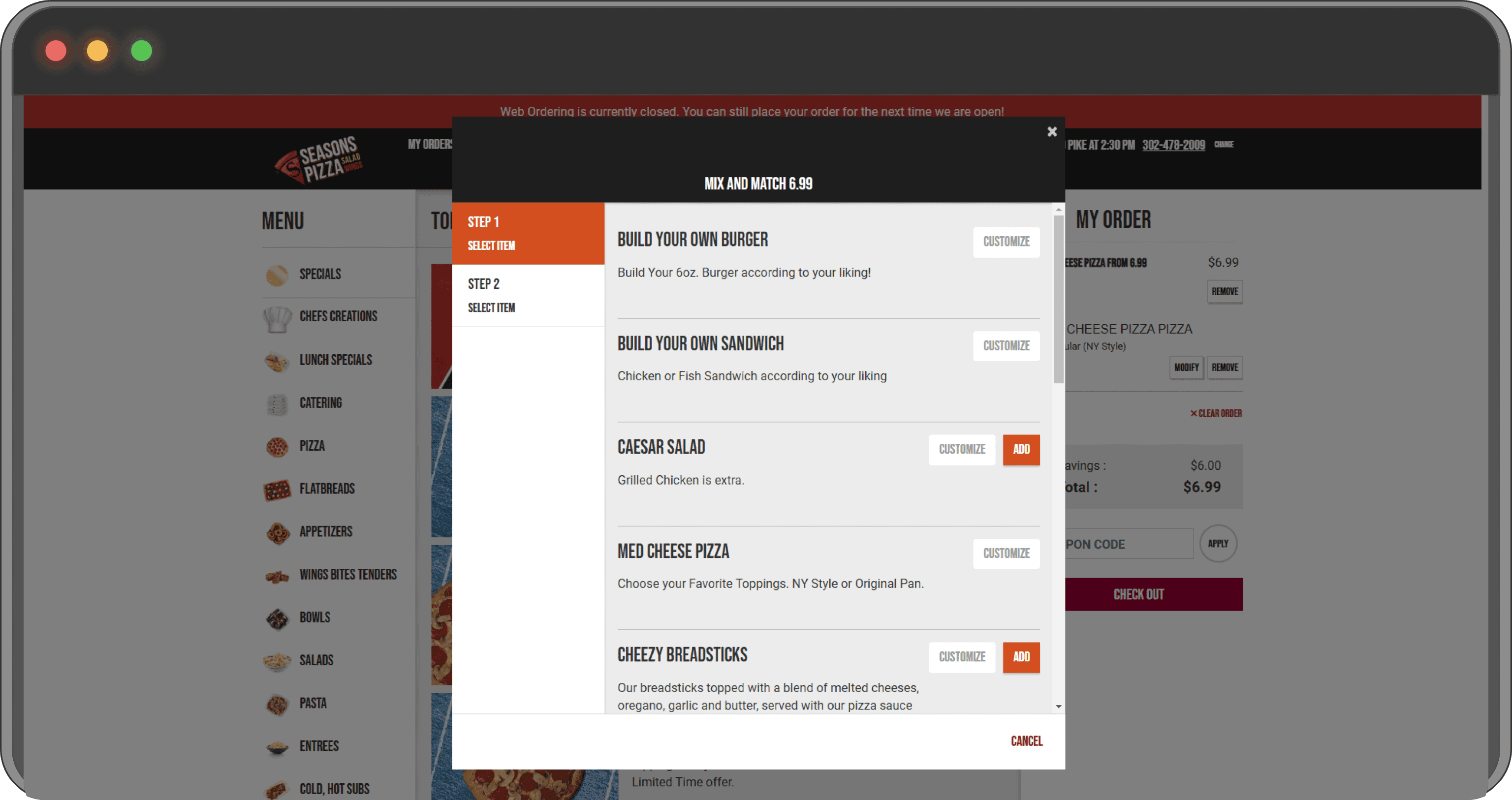
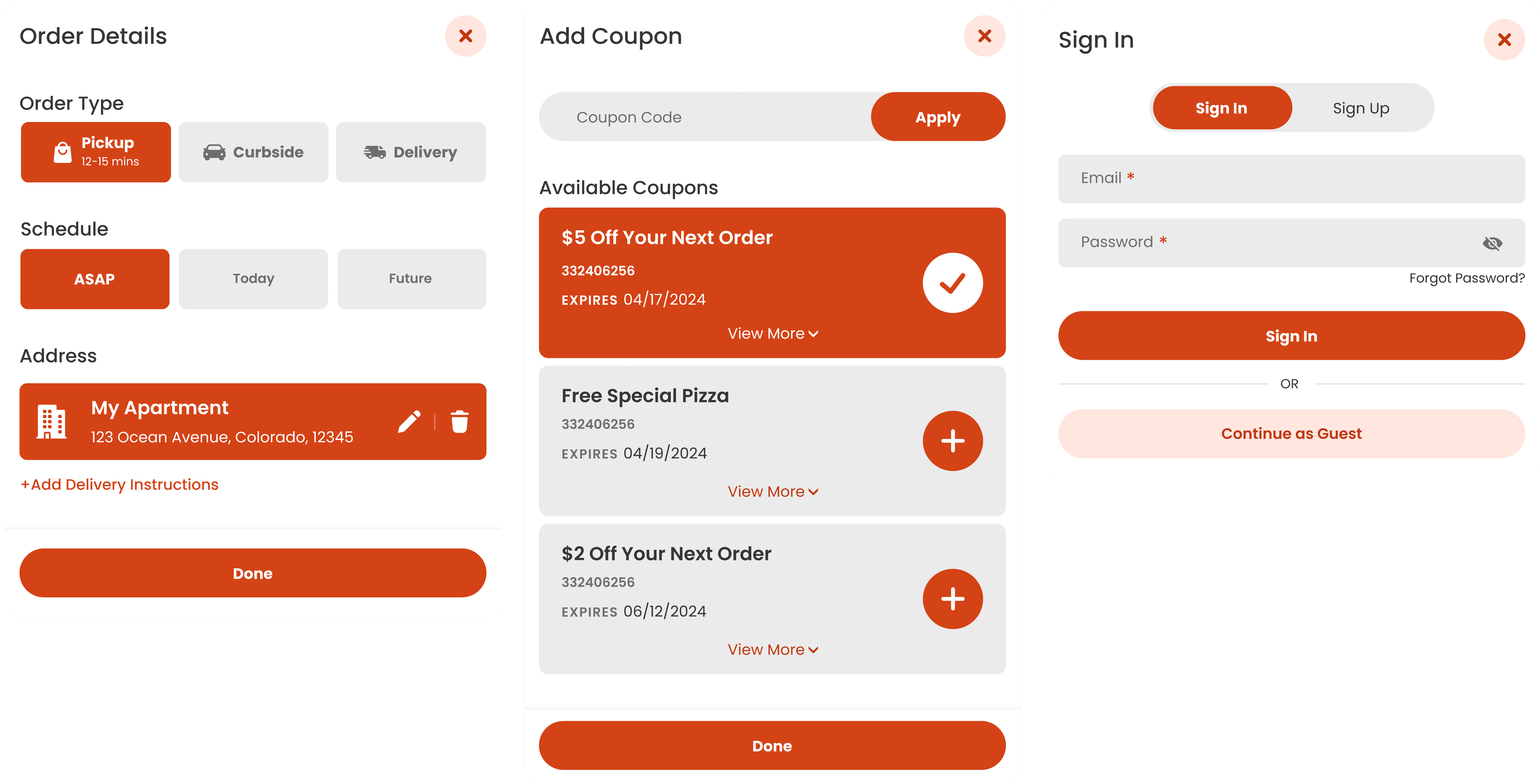
3. Special's Editor Usability Issues
The Special's Editor was revamped to improve its functionality and user experience:

1
View All Steps at Any Time
Users can see all steps of the wizard upfront (e.g., "Select a Pizza," "Select a Drink," "Select a Dessert") without needing to complete them sequentially. This allows flexibility in navigating between steps.
2
Easy Progress Tracking
Clear visual indicators (e.g., progress markers or icons) help users track which steps are completed and which remain, ensuring they feel in control throughout the process.
3
Clean and Intuitive Design
The wizard uses a minimalistic layout with clear labels and sections, making it easy for users to focus on each task without unnecessary distractions.
4
Inline Selection and Edits
Once a selection is made, users can immediately view their choices in the main interface with options to edit or replace items directly, streamlining the workflow.
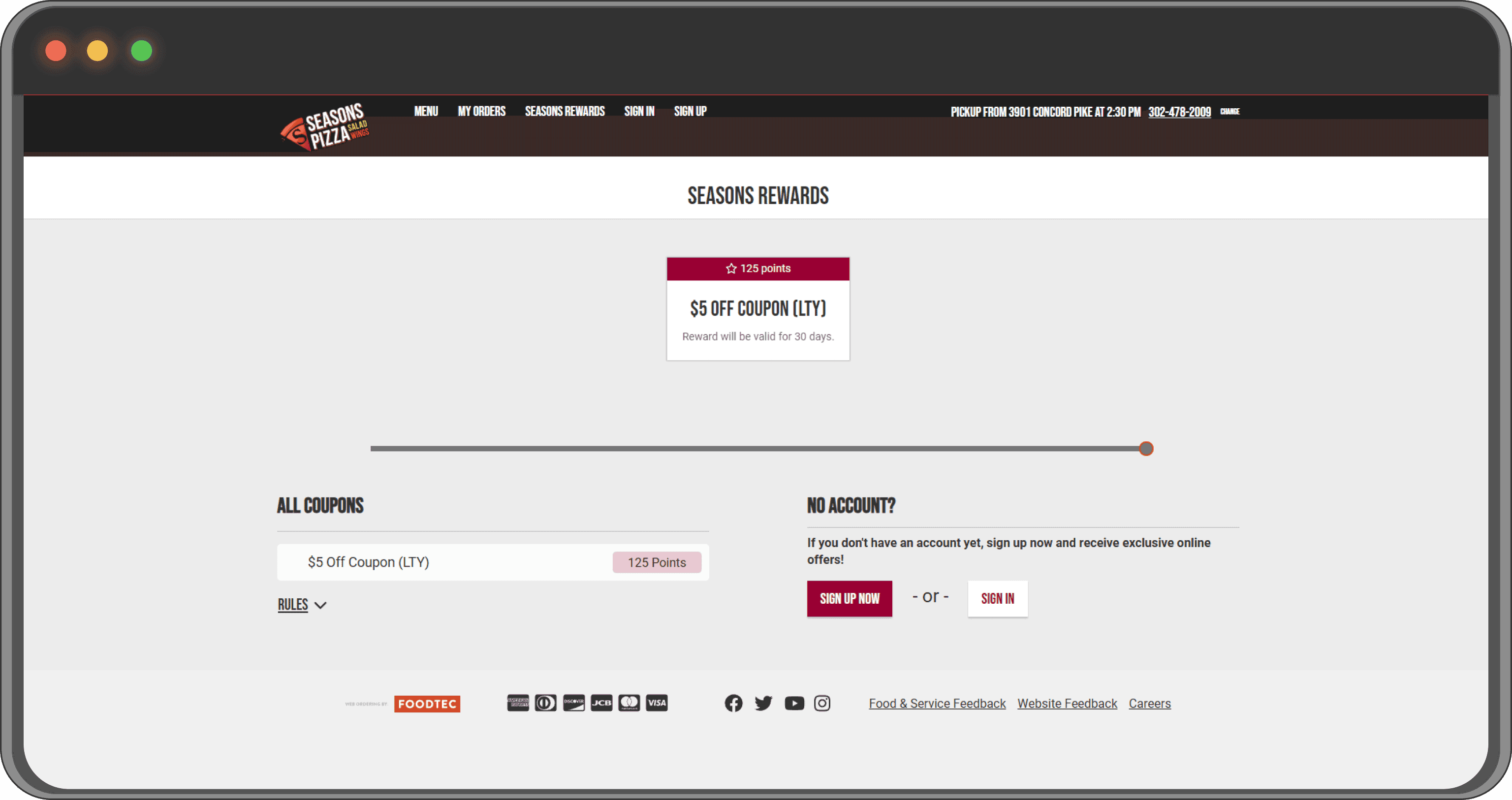
4. Low Subscriptions to Loyalty and Newsletters
To make loyalty and newsletter sign-ups more engaging, we focused on visual hierarchy and strategic placement:


1
Strategic Visual Placement
Rewards and sign-up options are placed prominently on the page, ensuring they catch the user's attention immediately. This addresses the issue of low visibility, which previously led to missed opportunities for sign-ups.
2
Clear Incentives for Joining
Users are enticed with visible rewards (e.g., "FREE 14'' large specialty pizza" or "FREE dessert at 50 points"). This demonstrates the tangible benefits of joining the loyalty program, motivating users to subscribe.
3
Simplified Sign-Up Process
A clean, user-friendly sign-up form is featured, requiring only essential details like email and phone number. This removes friction and lowers barriers to entry, encouraging more users to register.
4
Compelling Newsletter CTA
The "Get Deals in Your Inbox" section includes a clear, value-driven call-to-action, highlighting exclusive offers and time-sensitive deals that appeal to budget-conscious customers.
Additional Design Features
Responsive Design
The platform is optimized for all devices, ensuring a seamless experience across desktops, tablets, and smartphones.
Adaptive Color Scheme
The platform’s design adapts its color scheme to align with the store’s branding, offering a unique and personalized experience for each client.

Easy-to-Use Modals
Modals are used for key interactions, such as logging in, applying coupons, and editing items, with a focus on simplicity and clarity.
Loyalty Page Components
The tiered loyalty plan, with Bronze, Silver, Gold, Platinum, and Diamond levels, incentivizes repeat purchases by offering progressively greater rewards and benefits to loyal customers.

What Happened Next
From Design to Launch
After completing the final designs, the project transitioned into the development phase. The design handoff was conducted with meticulous attention to detail to ensure a smooth implementation:
1
Handoff to Developers
Detailed design specifications, including color codes, spacing, and responsive layouts, were provided to the development team through a collaborative design tool.
Interactive prototypes were shared to give developers a clear understanding of the user interactions and flows.
2
Active Participation in QA Testing
I collaborated closely with the QA team to test the platform across different devices and browsers.
Regular feedback loops ensured that the platform's visuals, interactions, and user flows adhered strictly to the original design specifications.
Issues like alignment inconsistencies, color mismatches, and button responsiveness were identified and resolved promptly.
3
Beta Launch with Nella’s Pizza
Nella’s Pizza, a long-standing client, became the first customer to test the platform in a beta environment.
The beta launch provided valuable real-world feedback, highlighting minor tweaks to improve performance and user experience further.
METRICS IMPROVED
Increased Average Order Value: The average order value rose from $25 to $32, driven by the effective integration of upselling features like "Size Upsell" and "Frequently Ordered."
Faster Checkout Completion Times: The average checkout time decreased from 3 minutes 40 seconds to 2 minutes 20 seconds, meeting the original project goal.
Reduced Cart Abandonment: Cart abandonment rates dropped from 38% to 12%, reflecting improved usability and trust in the checkout experience.
4
Lessons Learned
Importance of Collaboration
Early involvement of developers and QA testers ensured fewer revisions during implementation.
Iterative Design Pays Off
Prototyping and usability testing saved time during development by catching potential issues early.
Mobile Optimization is Non-Negotiable
With mobile users accounting for the majority of traffic, prioritizing responsive and mobile-first design proved essential. Features like sticky totals and persistent navigation made a measurable difference in engagement and conversions.
Simplicity Over Complexity
Simplifying the design, especially in the checkout flow and the Special’s Editor, reduced friction and increased task completion rates. This reinforced the importance of keeping interfaces intuitive and straightforward.
Other Projects
Mobile version is currently under construction; please visit our desktop site for full access.
Mobile version is currently under construction; please visit our desktop site for full access.
Mobile version is currently under construction; please visit our desktop site for full access.
Mobile version is currently under construction; please visit our desktop site for full access.